
Frontier is here
Frontier is now part of Idle Holdings in Version 1.1. Here is how a larger idea became a new stage of the game, and why the interface had to grow with it.
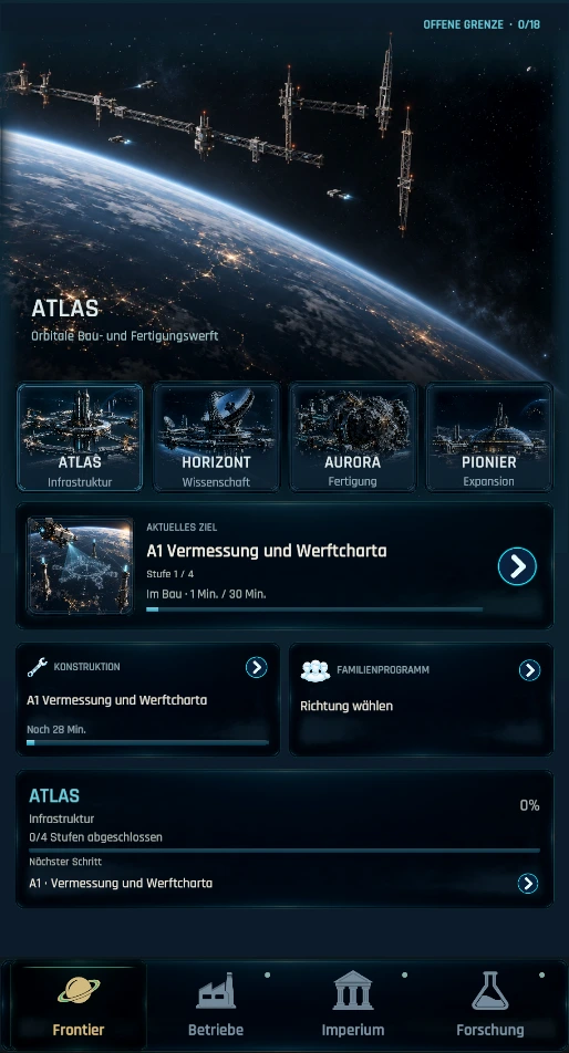
Frontier is now part of Idle Holdings. In Version 1.1, the economy you have built becomes the foundation for plans on a different scale. I spent a long time shaping that transition and revisiting what it should feel like. It is good to finally show it as a connected part of the game rather than a collection of unfinished pieces.
My earlier look at Frontier focused on the questions behind the design. I kept the images deliberately narrow then. This time I can show more of what those questions led to: dedicated project screens, longer-term Family Programs, and an interface that carries more information while still feeling like Idle Holdings.
More than another tier
I could have extended the late game with larger numbers, one more business tier and another resource. Each of those may have a purpose, but together they would still leave the player making essentially the same decisions on a longer list. I wanted the scale of the decisions to change as the Holding grew.
Businesses still matter. Their production, Research and the wider Empire give Frontier its footing. A major project builds on that foundation over several stages; it is not finished by a single purchase. I wanted the existing economy to remain recognizable, while making its reach feel different. That relationship between familiar systems and new plans is what took the most iteration.
Early versions did not always get the balance right. Some screens tried to explain too much at once. Others gave too little sense of why the next action mattered. The release version puts the current direction and the state of a project first. Requirements, choices and history have room when you open the relevant view.
Decisions with a longer horizon
ATLAS, HORIZONT, AURORA and PIONIER give Frontier a visible structure. Each major project has its own presentation and construction stages. Family Programs add another kind of long-term direction for the Dynasty. I wanted these ideas to work together: a project offers a concrete undertaking, while a program expresses a broader course that continues beyond one stage.
I particularly like that a project can hold the player's attention for a while. Its current stage gets the space it needs instead of sitting inside a wall of future requirements. Costs, materials and progress are still there, but they appear where they help with the next decision. The construction queue and project details follow the same approach: useful depth without forcing every detail into the first view.
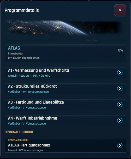
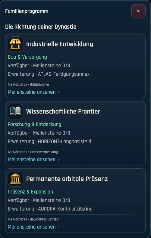
The program screen needed that restraint too. It should make the broad choice legible before asking anyone to read through milestones. A lasting decision deserves context, but on a phone it still has to look and feel like a decision. I kept returning to that distinction as the screen developed.
The interface had to grow with it
Frontier exposed places where the older screens could no longer carry the information comfortably. A business can produce several outputs and depend on several inputs. Empire has to hold the Holding, Dynasty and longer plans together. Research needs to show relationships without laying every description over the map. On a phone, all of those demands meet the same small display.
I leaned into staged information. The first view should answer simple questions quickly: Where am I? What is running? What matters next? Precise numbers, requirements and effects can have their own detail view. The recent Businesses interface overhaul in the main game had already made cards easier to scan and decisions easier to find. Frontier carried that work forward across Businesses, Empire and Research.
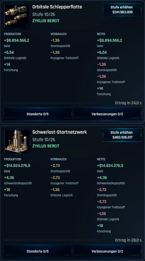
Businesses are a practical example. The orbital tug fleet and heavy launch network in the screenshot have several outputs and depend on different resources. Their cards should not become spreadsheets. The name and state come first, production and consumption have separate columns, and the upgrade remains easy to find. I spent a surprising amount of time on spacing, line breaks and the visual weight of small status messages.
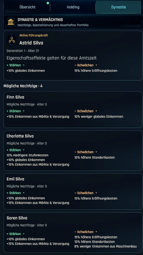
Empire called for a different kind of order. Holding and Dynasty belong together, but they do not need to explain themselves at the same moment. The Dynasty screen shows the current leader and possible successors with their strengths and weaknesses. Leadership has its own space instead of competing with every other Empire detail.
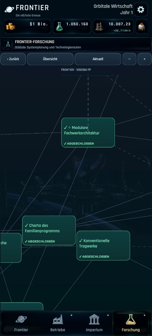
Research benefits from the same rhythm. The map needs to remain a map, something you can scan and move through. Selecting a node gives a compact preview first; opening its details gives the description and actions proper space. I can explore the connections without losing my place every time I need to read more.
Showing more, leaving room to discover
This entry shows considerably more than the first preview. These are current German Frontier captures; I did not want to reduce the release to a few narrow strips that barely show the actual game. A project can now be seen as a project: its own artwork, its current construction stage and a meaningful next step.
I am still leaving later dependencies, rewards and the turns taken by the other projects for players to find. This journal is my account of the work and choices behind the release, not a guide to every construction stage.
I am glad these pieces now meet in one place: familiar Businesses, an Empire with a longer memory, Research that connects the work, and projects with their own weight. I will keep refining readability and the smaller transitions. For now, I am pleased that Frontier can finally be seen as the next stage of Idle Holdings in its actual form.