
A First Look at Idle Holdings: Frontier
At some point I kept returning to one question: what should come after an established economy without reducing the answer to another row of larger numbers? Frontier grew from that question.

The question after a mature economy
Idle Holdings has always been about turning a modest beginning into an economy with more reach, more connections and more decisions. As the regular progression became broader, I eventually reached a point where attaching one more era to the end no longer felt like the right answer. The values could keep growing indefinitely, but scale is not very interesting if the experience around it stays unchanged.
Frontier began as my attempt to answer a different question: what could follow an established economy while still feeling unmistakably like Idle Holdings?
I did not want to discard the quiet rhythm of building businesses, watching systems become productive and deciding where the next investment matters most. That is the identity I want to preserve. At the same time, a later stage should ask for a wider perspective. Individual upgrades still matter, but they begin to sit inside longer plans and larger undertakings.
This is a first look rather than a complete explanation. Several systems are deliberately staying out of view, and many of the numbers are still being tuned. What I can show is the design direction and some of the interface work that has grown around it.
Not simply bigger
My earliest Frontier experiments leaned too heavily on the existing pattern. There were new things to build and new resources to consider, but the overall rhythm was still a longer version of the same list. It worked on paper. In practice, it did not create the change in perspective I was looking for.
The current direction gives long-term projects and programmes more presence. They are not intended to replace the business economy underneath them. Instead, they provide another level at which I can plan: something that can develop over time, create new constraints and make familiar resources feel different because of the context in which they are needed.
That balance is important to me. If Frontier ignored the main game, it would feel like a separate mode attached to the side. If it only asked for larger amounts of the same things, it would feel like a spreadsheet extension. I want the transition to be legible: the core loop remains familiar, while the horizon of each decision becomes wider.
I am intentionally not describing the complete resource structure, project dependencies or unlock conditions here. Those relationships are part of discovering the new stage, and some are still changing as I play through it repeatedly.
More information must not mean more noise
One of the largest practical problems has been the amount of context a phone can carry. Frontier introduces more relationships, but a mobile screen does not become wider just because the design has more to say. My first attempts kept adding rows, labels and status blocks until the important information was technically present but increasingly difficult to read.
The better answer has been staged information. The current context belongs at the top. Values that matter for the immediate decision stay close by. Secondary explanations and choices can move one interaction deeper, where they have enough room to be useful instead of becoming abbreviated fragments in a crowded overview.

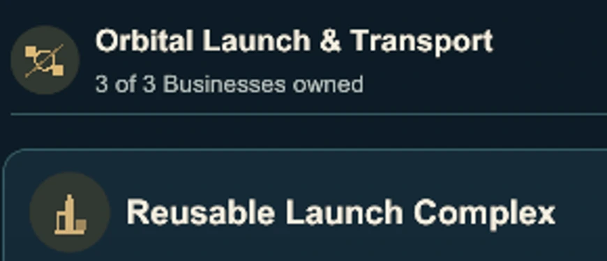
The resource row is a good example. A long vertical stack would steal space from the decisions below it. A horizontal presentation lets the most relevant values remain available without turning the header into half of the screen. It also gives me a rule for future additions: appearing in the data is not enough; a value should be visible when it has become relevant to the player.
The same principle applies inside business views. Identity and status need to be clear before every possible action is shown. Focused location and improvement views then provide the space for a deliberate choice. That makes the interface calmer without pretending the underlying economy is simple.
Frontier also changed the main game
An unexpected benefit of working on Frontier was how clearly it exposed weaknesses in the earlier interface. When a component had to carry another resource, a longer name or a more complex state, small compromises in the main game became much harder to ignore.
That fed directly into the recent work I described in Reworking the Interface of Idle Holdings. Business cards gained a clearer hierarchy. Resource handling became more contextual. Detail views took over information that did not need to compete with the main list. Shared surfaces and navigation became quieter and more consistent.
I have tried to build those pieces as one visual foundation rather than two parallel interfaces. A status treatment or resource component should behave predictably in both places. The composition around it can still change. Frontier needs room for larger plans; the main game needs a fast overview of businesses and the next useful action. Related does not have to mean identical.
A surprising amount of this work lives in small details: where a section begins, how a long label wraps, when a resource becomes visible, or whether opening a detail feels like leaving the current task. None of those decisions is the headline feature. Together, they decide whether the additional complexity feels deliberate or merely crowded.
Larger undertakings need more room
I spent a while presenting the larger projects as a long vertical list. That made every option available, but it also made each one feel like another checklist entry. On a phone, the screen became a sequence of headings, requirements and buttons with very little sense of focus.
The newer presentation gives one undertaking the central space and lets me move between the available directions. A project can have a visual identity and a clear current stage without every other project competing beside it. The programme layer follows the same idea: it should communicate a long-term direction, not become a wall of simultaneous explanations.
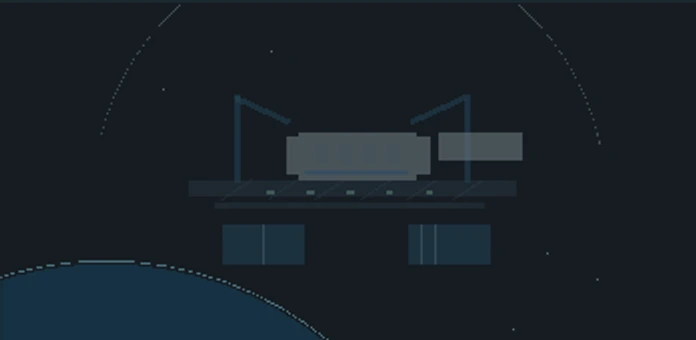
That shift sounds simple, but it changed how I think about the whole section. It is no longer a place where everything must be visible at once. It is a place where the current plan should feel concrete, while alternative paths remain close enough to compare when needed.
Some things are still in motion
Frontier is still being shaped through use. I am adjusting pacing, revisiting which information deserves to remain permanently visible and checking whether a long-term choice feels meaningful after the novelty of its first presentation has worn off. The relationship between businesses, resources and larger projects has to remain understandable across a much longer stretch than a single screenshot can show.
There are also parts I simply do not want to explain yet. A development journal is most useful when it shows the thinking behind the work, but discovery still matters. I would rather leave room for that than turn this first look into a catalogue of every system already on my screen.
The goal has stayed consistent: extend Idle Holdings without losing the satisfaction of its original progression. Frontier should feel like the economy has reached a new stage, not like the game has been replaced. I am enjoying the slow work of finding that boundary—and, just as importantly, deciding what does not need to cross it.