
Reworking the Interface of Idle Holdings
I kept coming back to the same problem: the economy had become more interesting, but the interface was making it harder to understand. This overhaul is the result of rebuilding that presentation around the decisions I actually make while playing.
Why I wanted to change it
Idle Holdings started with a much simpler economy. The first interface could show a business name, a few values and an upgrade button without much tension. As production chains, locations, research, the family estate and succession became more important, that same structure had to carry far more information. It still worked, but I was no longer happy with the amount of effort needed to read it.
I kept coming back to the Businesses screen because it exposes the problem most clearly. A player needs to know what a business produces, what it consumes, whether it is running, how long a cycle takes and what the next investment changes. My earlier layout placed much of that information on screen, but it treated too many values and actions as if they had equal importance.
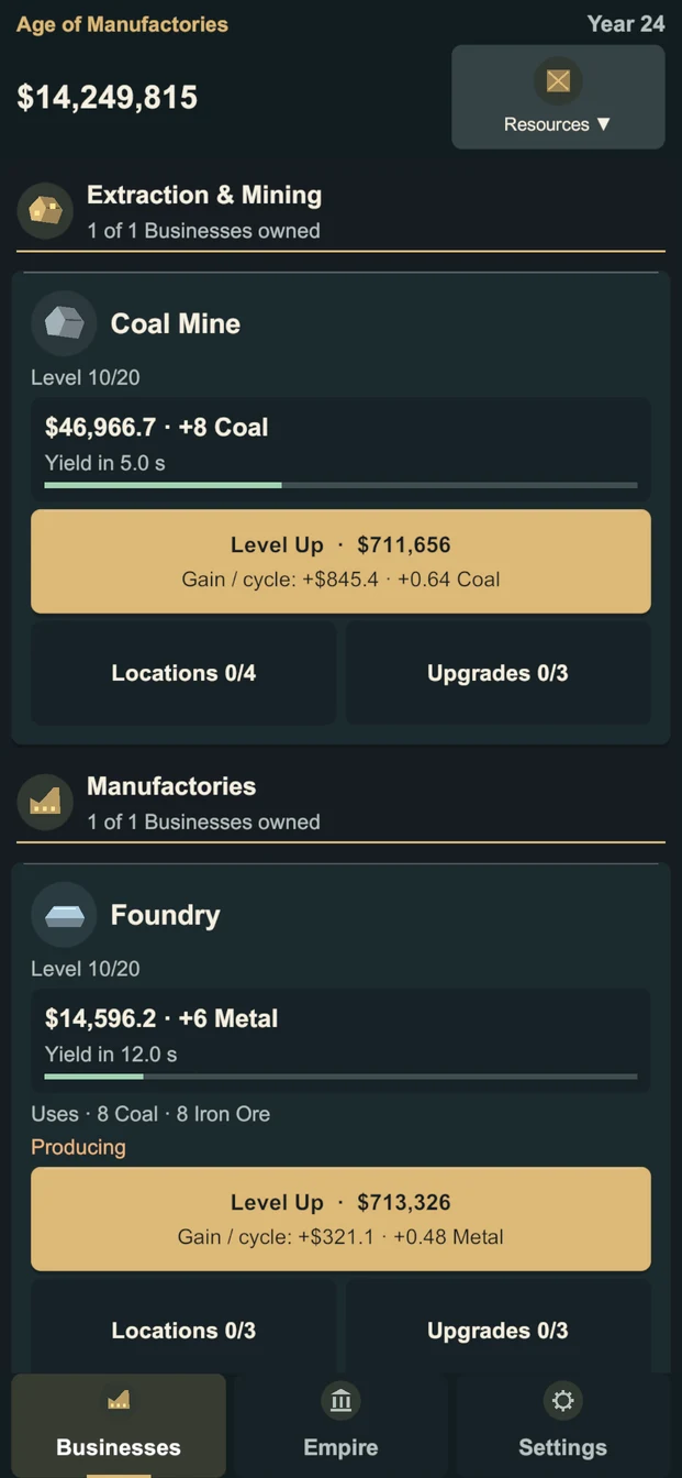
I initially tried to solve this by refining individual cards. That helped in isolation, but what looked fine on a mockup became too dense on a phone once a full industry, the persistent header and the bottom navigation were visible together. The problem was not one button or one font size. The information hierarchy needed to be reconsidered as a complete system.
Making the Businesses screen easier to read
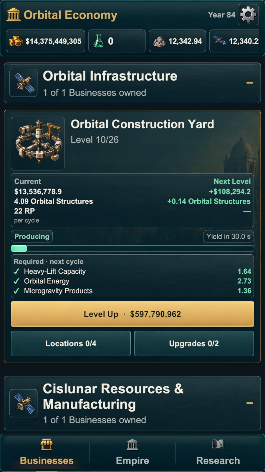
The current screen begins with context. The era and year sit above the values that matter at that moment. Below that, businesses are grouped by industry and use their own illustrations, so I can find a coal mine, a steelworks or an orbital construction yard by shape before reading every label.
Inside a business card, I separated the current result from the next level. The left side describes what the business produces now; the right side shows the gain from an upgrade. Production status and cycle time use two compact information surfaces instead of one long bar. When a production cycle needs resources, those inputs stay close to the status rather than being hidden behind a second screen.
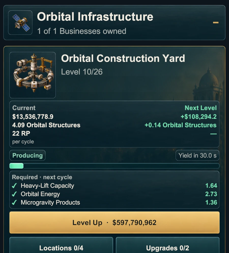
The important thing for me was not to simplify the economy by deleting useful information. Players who want the exact values should still have them. The redesign instead separates what needs to be understood at a glance from what belongs in a focused detail view.
Less repetition, clearer actions
The old version relied heavily on full-width buttons. They were easy to recognize, but repeating the same visual weight for leveling, locations, upgrades and secondary actions made every card feel longer and louder than it needed to be.
I ended up keeping the level-up action as the clear primary decision. Locations and upgrades remain beside it, but their details now open in focused sheets. Location choices can show the available focus options and preview an effect before it is confirmed. Upgrade entries keep their authored description, requirement, effect and cost together. Recent work also anchors these detail views as bottom sheets inside the safe screen area, so they behave like a deliberate mobile layer rather than another page pushed into the list.
I deliberately kept real costs, requirements and locked states visible. A quiet locked control is more useful than a missing action because it explains why something cannot be used yet. At the same time, a secondary action no longer needs to imitate the gold primary purchase button just to remain discoverable.
Resources and context where I actually need them
Production chains are difficult to reason about when the resource information is somewhere else. The header now keeps money, research and relevant production resources in a horizontal row. It does not reveal every future resource at the beginning of the game. The set is driven by the current state: resources become relevant through opened production recipes or retained stock.
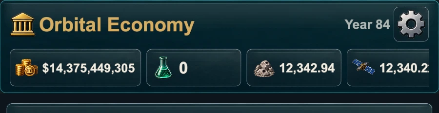
Long values were another practical problem. A fixed chip width either wastes space early or clips numbers later. The current components measure the displayed value and widen within defined limits. That keeps short values compact while still giving large late-game amounts room. The row scrolls horizontally instead of forcing the entire header to become taller.
Building it for a phone, not for a mockup
I wanted the interface to work at the proportions people will actually hold, not only at one ideal screenshot size. A narrow display changes how quickly German labels wrap, how many resource chips are visible and how much of the next business card provides useful orientation below the fold.
German and English therefore share the same hierarchy, but they are not treated as identical strings poured into fixed boxes. The longest era names receive measured, single-line fitting in the persistent header. Business names and descriptions are allowed to wrap where wrapping preserves meaning. Controls can grow when a translated status genuinely needs more room, while compact labels are not padded to the size of the longest possible sentence.
The bottom navigation was simplified for the same reason. Businesses, Empire and Research sit on one continuous surface, with Settings remaining in the header. Only the current destination receives the warm selected treatment, so the bar remains easy to scan without becoming another decorative panel.

A UI system I can keep extending
This was a presentation overhaul, not a replacement of the game underneath it. Idle Holdings already builds much of its interface at runtime, so I retained the existing state bindings, navigation callbacks and gameplay services. I refactored the presentation around reusable cards, status chips, surfaces, transitions and detail sheets instead of introducing a second UI architecture.
That distinction matters. The same resource component can deal with short and very large values. The same restrained material treatment can support a business card, a research entry or the family estate without making them identical. Industry and business artwork is mapped to the actual authored content rather than a generic fallback, and the layout can reuse those mappings in current businesses and legacy views.
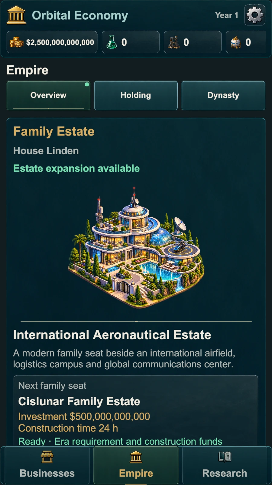
One of the harder parts was deciding where consistency should stop. Reusing spacing, surfaces and interaction rules makes the game easier to learn. Forcing every screen into the same card-and-button pattern would make the estate, research and dynasty feel interchangeable. I decided to share the system while preserving a different composition for each kind of decision.
Still not finished
After using the new interface for a while, smaller issues became easier to see: low-speed scrolling that settled between pixels, empty resource details that should not open, or a detail view that felt like a panel at the top instead of a mobile sheet. Those have already led to focused follow-up changes.
There will be more of that. New eras and systems will put different pressure on the layout, and physical devices will always reveal details that an editor capture cannot. The overhaul gives me a much stronger base, but I do not consider interface work finished simply because the main structure is now in place.
Changes in this update
Show the concise update summary
- Reworked Businesses cards, industry grouping and current-versus-next-level information.
- Improved production state, cycle timing, resource inputs and relevant header resources.
- Refined location, upgrade, Estate, Holding, Dynasty, Research and Offline Return presentation.
- Strengthened German and English layouts across narrow and tall phone proportions.